
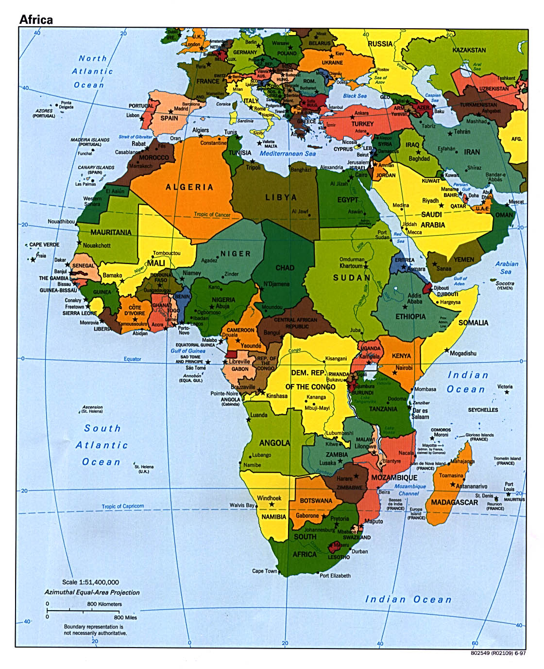
This is a map of Africa. The different color has no meaning. It's purpose is just to separate between the countries. At the lower left hand is the scale of the map. Notice that this map is a small scale even though it covers a large area of land.

This is the world's map. Again, the different color has no significance other than to separate between countries. Unlike the map of Africa, this map is showing large area of land therefore this map has a small scale. You can see at the bottom left corner that a few centimeter is thousands of kilometer in the real world. This map is not complete because it does not show the scale ratio between map and land.

Unlike the previous two maps, the coloring on this map provides several information. This is a map of the world's religion. We can see there is high intensity of people with a particular religion in one region and low intensity in another. This map also tells us about the diversity of religion group around there world. It is interesting how much this map overgeneralize the religion group when in reality there are hundreds more religion unaccounted for.
10/10
ReplyDelete